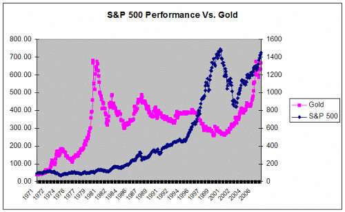
I just found a chart on the Web that summarizes my thoughts on the run-up in the current market. The chart which plots the price of gold versus the S&P 500 since 1971 shows that for the most part these two investments have run counter to each other (you can see the chart by clicking on my profile and going to my page). In the 70's gold soared while the market stayed flat. Inflation no doubt played a part in that. In the 80's and 90's during the current bull-market, the market soared and gold performed poorly.
In 2000, as the stock market was melting down, gold started its ascent. And that's where it gets interesting. Since 2002, roughly the start of the Iraq war, both gold and the stock market have moved higher in tandem, an almost unprecedented occurrence.
Looking at this chart, it's not hard to see that at some point the two asset classes have to diverge. The question is which one, when, and what will the catalyst be.


Comments
Anonymous
July 20, 2007
Great article. The chart is a little scary. You are right that something needs to break.
Is this review helpful? Yes:0 / No: 0
Anonymous
July 20, 2007
We are in a period of extreme liquidity where everything is appreciating in value, except for real estate (which I believe is only declining in the US).
Is this review helpful? Yes:0 / No: 0
Goldie
May 15, 2008
This is very interesting. I'd like to see this chart updated to reflect what has happened over the last six months. I suspect you'll see that both investments have dropped.
Is this review helpful? Yes:0 / No: 0
Angel 62
April 03, 2010
And how this chart corelates against printed $$$s?
Is this review helpful? Yes:0 / No: 0
Add your Comment
or use your BestCashCow account