One of the comparisons I’ve thought a lot about when pondering the current economic crisis, is the United States today and Japan during its “lost decade.” In the 1980s Japan went through a period of rapid growth. Its stock market, the Nikkei as well as real estate prices shot up at phenomenal rates, fueled by easy lending from the banks and a booming export market. By 1989, Japan’s Nikkei had increased from 2,000 in 1970 to 39,000, a 1,858% increase. One square block of Tokyo was worth more than all of the real estate in Manhattan.
And then the bubble popped. The Nikkei dropped like a lead balloon, shedding more than half of its value in three years. Real estate values followed the stock market down and banks were stuck with a portfolio of toxic assets. To try and stem the bleeding and right the economy, the Japanese central bank cut interest rates to 0% and embarked on many of the same quantitative easing programs we are seeing today from the US Fed. The government also began a massive public works project that pumped hundreds of billions of dollars into the economy.
Thinking about how this sounds very familiar with the US economic situation today, I decided to compare historical Nikkei data with more current Dow Jones Industrial Average information.
On the first chart, I performed an analysis that is similar to the one I did comparing the Dow today to its performance during the Great Depression. I graphed the Nikkei from 1970 to 2009. Using the other Y axis, I graphed the Dow from 1988 to 2009. The 0 point on the graph represents the high point of both markets – 1989 for the Nikkei and 2007 for the Dow.

You can see the result. From its high at 0 point to its drop three years later, the Nikkei shed 57% of its value while the Dow has shed 44%. If the Dow was to follow the Nikkei’s lead and drop by 57%, then we could expect it to bottom out at around 5,700 (where the yellow line meets the blue in Year 3).
Is this reasonable? Data from the Nikkei as well as from the Great Depression Comparison seems to show that with severe economic crisis, markets fall by over 50% and often by greater than 60%. In other words, the severity of the crash is proportionate to the level of the run-up. Japan experienced a huge run-up in the 1980s. The US experienced a large run-up before the depression. Both led to a severe crash in the markets. Since all economists seem to agree that we are in the biggest economic crisis since the depression, it’s fair to think that the stock market’s losses will reflect that.
Still, I wanted to see how the Dow run-up compares to the Nikkei before it popped. The second chart shows this comparison. To fairly compare the two indexes, I set both to a value of 1,000 20 years before their peak date. I then changed the value by the % gain or loss that both markets experienced over the following years. Point 0 is once again the peak of each market (1989 for the Nikkei and 2007 for the Dow).

As the chart shows, while the Nikkei experienced a 1,858% increase until its peak point, the Dow only showed a 500% increase during that period. The crash of the Dow in 2000-2002 (the Internet bubble) in effect deflated the bubble. While the Dow recovered over the next 6 years, its peak in 2007 was only 15% higher than in 1999. While the Dow was up over the last twenty years, its growth was much slower than the Nikkei’s and other classic bubbles.
I think there are three possible conclusions that can be drawn.
- The Dow in 2007 was not at bubble levels and as a result, a 44% drop makes it oversold. This is a buying opportunity.
- The drop in the Dow reflects a US economy that is much weaker than Japan’s after its bubble popped. Japan’s bubble was corporate led and by and large its consumers came out of the crash with savings and cash. In the US, the consumer, the main driver of the economy, has been saddled with debt that will depress spending for a long period of time.
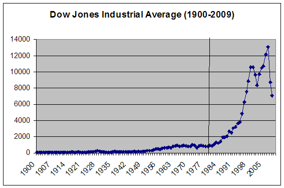
- The drop in the Dow reflects the regression of the market to its normal growth rate before it was stimulated in the 1980s by deregulation, large deficits, baby boomer cash, and financial sophistication (derivatives, securitization, globalization, etc.). From 1980 to its peak in 2007 (see chart below), the return on the Dow was 1,300%, much closer to Japan’s 1,800%. In other words, I needed to go back further in the analysis to really capture the true extend of the Dow bubble.
So what does this all mean?
If you believe that point number one is valid, you should go out and start buying stocks. This is the buying opportunity of a generation.
If you believe points number two or three, or some combination of them then the market will not go back to its past return for many years. As the chart shows, the Nikkei still hasn’t recovered from the good times of the 1980. Today, 29 years later the Nikkei is at 7,568, a 29 year low and 80% below its peak in 1989.
Extrapolated to the Dow, that means a future price of 2,652 in 2036.


Comments
ktexas
February 28, 2009
Hard to imagine how bad it would be for all the long-term investors if the Dow actually comes close to 2,652 in 2036.
Is this review helpful? Yes:0 / No: 0
Ben
March 01, 2009
great job with those numbers. Very impressive.
Is this review helpful? Yes:0 / No: 0
rob
March 01, 2009
Excellent points! The similarities between the reasons behind the Dow's collapse and that of the Nikkei are very similar. We in fact face many more challenges and challenges that are much more profound than Japan did in the 1990s so I ascribe to point 2. But, I also believe point 1 and none of this means that the US market is as doomed on the intermediate and long term. While discounting point 3, I do think that we are getting a double or triple wammy here with debt and a slowing economy so my own view, however, is that it goes much lower over the short term.
Is this review helpful? Yes:0 / No: 0
AronLiv
March 02, 2009
I am afraid that the Nikkei and 1929 are the correct comparisons. I made and lost fortunes in the emerging markets crash of 1998, and in the tech crash in 2000-2002. In each of those cases and even after 9-11, there was an underlying certainty that while things had gotten way ahead of themselves, there were underlying market forces which were going to continue to attract capital and things were going to be OK. We all knew that these markets were going to bounce back and they did. This is a much more profound change with deeper and broader effects. Unfortunately, those of us in our 40s cannot look to experiences in our investing history to provide the guide for the current circumstances.
Is this review helpful? Yes:0 / No: 0
jtww
March 11, 2009
The damn thing is becoming a self-fullfulling prophecy because we are making all of the same mistakes Japan made, including trying to save failed banks.
Is this review helpful? Yes:0 / No: 0
your friend
June 24, 2009
Good comments ppl. Don't forget that the Dow today is not the same Dow in absolute value terms that it was 10 years ago. Inflation-unadjusted, we are feeling good about the raw number, but in truth a Dow of 8500 may be more like 5000-6000 when u adjust for even modest inflation! So while we might never see Dow 2300, we may see its "value equivalent" (i.e., Dow 23000) in 10-15 years. If you crave for the "greater number" be my guest. I like "greater value". And don't forget the P/E ratio thing... It's still very high... Unsustainably high! (i.e., earnings ain't getting any better soon)
Is this review helpful? Yes:0 / No: 1
curious
October 09, 2009
Wow i envy you people to actually inderstand half this stuff. :)
Is this review helpful? Yes:0 / No: 0
Alcibiades
July 30, 2010
So what's your point?
Is this review helpful? Yes:0 / No: 0
Kenny
April 10, 2012
Can someone tell me how the Dow Jones relates to the Nikkei index please....
Is this review helpful? Yes:0 / No: 1
Add your Comment
or use your Google account
or use your BestCashCow account