When I was in banking school several years ago, I had an instructor who handed out a metrics sheet. The sheet followed twenty or thirty macro-economic indicators. These indicators, the instructor said, will give you a pretty good idea of what’s happening with the economy. For example, the instructor said that whenever oil got above a certain price range, there was always a recession. And if you looked at the price of oil and matched it to recessions you could see a strong link, I would even say correlation.
So, several days ago, I decided to start constructing my own sheet of investment indicators. I plan on expanding the sheet over time but I wanted to share my first iteration of it.
The four factors I am currently charting are: oil, savings account rates, gold, and the S&P 500. At some point in the future I plan to add Treasury yields although I’ll have to determine the correct term (bills, notes, bonds).
I started with some data from an article I wrote in July of 2007 (when the S&P was above 1,400) on the unprecedented correlation between the S&P and gold. I wrote at the time:
In 2000, as the stock market was melting down, gold started its ascent. And that's where it gets interesting. Since 2002, roughly the start of the Iraq war, both gold and the stock market have moved higher in tandem, an almost unprecedented occurrence.
Looking at this chart, it's not hard to see that at some point the two asset classes have to diverge. The question is which one, when, and what will the catalyst be.
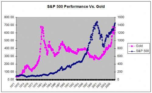
Well, we know what happened. The S&P tanked and the catalyst was an unprecedented global financial meltdown kicked off by sky-high oil prices (notice the oil price and recession connection again) and then a collapsing real estate market.
To me, this chart speaks to the power of comparing broad indices and trends. You don’t need a supercomputer and a team of nerds to make smart investment decisions, just some decent data and common sense.
I took Sam’s data, added the other assets, and made it current. To normalize it, I assumed that a $100 investment was made in 1970 in each of the assets. You can see the return below:
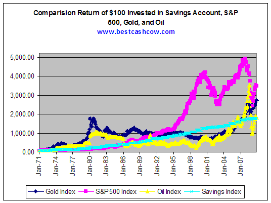
This led to several observations:
- Over the last 30 years, the the S&P 500 generated about 2x the return of a savings account. Everyone would take that difference but I surprised it wasn't higher. After all, we're talking about a 30 year period and we're compaing it to a savings account.. I wrote about this several months ago in an article entitled Comparison of Stock Returns to Savings Account Returns Shows Buy and Hold Not A Good Investment Strategy.
- The S&P 500 showed quite a bit of volatility over the last 14 years. The $100 invested in 1970 would have risen to above $4,000 in 2001, only to fall back to $2,600. It would then rise again to almost $5,000 before falling back to $2,700 and then beginning its current rebound.
- Bubbles in markets are easy to spot, at least in hindsight. You can see the giant bubbles in the S&P and in oil. Anytime something rises too fast, too far it falls back, even if the overall trend over the years is up. Another way of saying this is that returns do eventually revert to some type of mean.
I decided to see if I could up with some kind of mathematical formula that would help detect periods when the market was high (and is a sell) and when it is low (and is a buy). I decided the best approach was to compare the market return with that of savings accounts. I chose savings accounts for several reasons:
- Savings accounts are liquid and easily purchased. People can move in and out of them relatively quickly.
- They offer a higher return than Treasury bills.
- They are a risk free investment (if you stay below FDIC Insurance levels).
The primary disadvantage of using the savings account rate as the risk-free benchmark is that FDIC insurance only covers $250,000 per person per bank. Someone with $5,000,000 will have a harder time executing this strategy using a savings account. Still, as I found out, one only needs to perform three transactions over a 30 period to execute the strategy.
The chart below compares the return on the S&P 500 (including dividends) with that of the savings account rate. In the difference column I subtract the savings return from the S&P 500 return. As an example, in 1971, the S&P yielded 5 percentage points more than a savings account. In the cumulative column, I summed the difference.
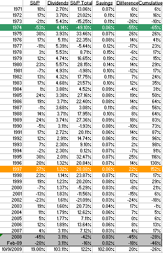
After eyeballing the chart, I decided that whenever the difference was -50% or greater, it was a buy signal. This represented a period of intense underperformance of the stock market and a buy low opportunity. In the following year, I would reset the cumulative metric and let it run again. Whenever the cumulative reached 135% or higher, it was a sell signal. That happened in 1997 as stock gains began to far outpace risk free savings accounts (a bubble was forming).
Looking at the table, what the strategy would have recommended was buying heavily into the stock market in 1975 and then selling in 1987. This is not a day trading strategy but rather a strategy that relies on long-term cyclical shifts in the underlying psychology of the market. Also note that by selling in 1987, an investor would have missed the great gains of 1988, 1989, 2003, and 2006. I was a bit surprised at just how well it did. Clearly, preserving capital, even when it is stashed in unsexy, lower yielding savings account for long periods of time, can a better strategy than risky investing in an inflated market. Let me repeat, according to this analysis capital preservation is the name of the game, not getting every last bit of return out of a tired stock market.
My next step for this model will be to compare it to a dollar cost averaging strategy. But I suspect it will do much better. Why dollar cost average into a market that is inflated?
Which brings us to 2009. In 2008, the indicator went to -18%, and then in February and March of 2009, the indicator reached a low of -46%. That's pretty close to the buy level. It didn't stay there for long and has since recovered to -26%. I'm sticking to my guns and not calling the market a buy. If we are to be optimistic and believe the economy will get on track again, then now is a buy. But if we think the American equity markets will behave like Japan, then it won’t be a buy for a long, long time. See: How Low Can It Go? Comparison of the Dow Jones to Japan's Nikkei Index. I think we're somewhere in-between these two scenarios.
Based on the Nikkei chart, I probably need to do a bit more fine-tuning on the model, incorporating foreign market information.
I plan on updating and adding to the metrics on a monthly basis. I’d also like to do a capital preservation analysis on oil, gold, and other assets. If there is anything in particular you’d like to see, let me know. Or if you have any comments/critiques feel free to add them below.


Add your Comment
use your Google account
or use your BestCashCow account